Saturday, December 21, 2013

Into the Vortex


New game! I made it for Ludum Dare 28, though I ended up finishing five days late. The theme was "you only get one." The whole game is basically just an extended boss fight, and it takes less then five minutes to play through if you don't die. It is designed to take several attempts though, and if it's too hard or too easy you can adjust your starting health in the options menu. The music is Bach's Little Fugue in G Minor.

Download "Into the Vortex" here.

Saturday, December 7, 2013

Mother 3 and Abstraction


The most important scene in Mother 3 takes place around a fireplace. The scene is set up so that you can see all of the characters at once; the viewing angle is distant and constant. It feels like a stage play, but unlike in a play the characters aren't even real people − they're tiny, pixelated representations of real people. Imagine how different this scene would feel in a movie, where the camera could zoom in and around real life actors showing emotions on their real life faces. It'd be so much bigger, so much more immediate.

In Mother 3, there's an unbreachable distance between you and the characters. You can't make out their facial features, you can't hear what they're thinking, and some of them don't even speak. The characters who do speak say weird, eccentric things, and this is more evident around the fireplace then it is anywhere else. ("The good news is that I found you a new T-Rex fang that you can use as a weapon in battle. The bad news is...")

This wasn't an accident. Art is about storytelling and communication, and more than any other medium, games communicate through abstraction. No series understands that better than Mother.

The scene around the fireplace is filled with abstractions. Like the many, many other beautiful, perfect moments in Mother 3, this scene resonates with people because abstractions work in a powerful, indirect way. Boss battles, experience points, pixel art, chiptunes, silent protagonists; these pieces of artifice lull you into an emotional sense of security. They present to you a world that feels unreal.

But then scenes like the one around the fireplace come around, and you suddenly realize that all of these abstractions represent very real, human truths. Everything is recontextualized, and the moments that just seemed cute and funny before become intensely meaningful. Then the scene passes, the artifice builds itself back up, and you regain your sense of security, only for it to come crashing down yet again. Eventually the credits finally finish rolling and the revitalized logo fades in, and you realize that every single moment in the whole game was part of one person's tremendous, moving, singular vision of the human experience.

It's not a complete picture. It's not even meant to be. It's just one person's attempt to communicate some sort of raw, personal truth that they could feel inside them. And being able to share that truth with someone else − that's transcendence. It's the very purpose of art.

Saturday, November 2, 2013

Fugitive


So! I finally finished the game I've been working on for the past five months. I'm extremely proud of how it's turned out. You can download it for free right here. Give it a look!

The soundtrack was all from the Newgrounds audio portal, so if you're interested in listening to more of their tunes you can find their channels here:
Monk1
Ajiman
Theeketel
Xerferic

Thursday, August 22, 2013

Super Xalaxer


Super Xalaxer is a crowd control game with a perfect, bite-sized idea at its core. You have two ships. One is controlled by the keyboard, the other by the mouse. You can only move horizontally, and your ships fire automatically. You are constantly beset by hundreds and hundreds of tiny popcorn enemies, and if enough of them get past you in a short span of time, you die. What a pure, lovely premise for a flash game.

Have you ever tried to rub your stomach and pat your head at the same time? It's not hard, but there's certainly an element of confusion to moving your hands in such different ways simultaneously. That Super Xalaxer causes that confusion is interesting on its own, but that it actually harnesses it towards making a genuinely fantastic action game is incredible.

Most of the game is made up of moving your two ships back and forth, trying to hold back the hundreds and hundreds of enemies. Beyond that, there's very little variation throughout its eight levels. There are only a handful of truly different enemy types, and only two stage layouts.

This simple approach is a good thing. Layering too many ideas over that core dynamic would only muddle the game's appeal. And while there are a few gimmick moments that focus more on obstacle avoidance than crowd control, the game never dwells on them. A lesser work would have focused exclusively on sequences like the asteroids at the end of the level three, or the escape sequence after the final boss, but in Super Xalaxer they're just a pleasant bit of spice between the more meaty enemy segments.

The highlight of the game is easily the climax of level seven, where you independently hold back vast numbers of enemies with one ship while fighting a boss with the other. Instead of running both ships back and forth across the screen trying to take out as many enemies as possible, you have to use each of them independently in very different ways. It's mind-bending, exhilarating, and the hardest part of the game.

Interestingly, the last level, while more visually intimidating, is significantly easier (much like Ikaruga, one of Rhete's documented inspirations). It's an elegant twist of pacing that delicately eases the player out of the experience, and it's one of the many subtle touches that elevate Rhete's work over conventional browser game fare.

Rhete has been making games for years now, and this is his most mature work yet. Like his recent game Bullet Maze, it drops the dialogue-heavy approach of his older games in favor of a focus on pure mechanics. And while his seven-hour epic Hunters: Relic of the Stars was filled with brilliant moments and ideas, the scale of smaller games like Super Xalaxer and Bullet Maze seems to better suit his design sensibilities. I can't wait to see where he goes from here.

(Yes, it's been a while. I've been funneling all of my creative energies into my inverted Metroid game, which should be done in early October. Look forward to it!)

Thursday, May 16, 2013

Quarantine


I made a game! You can download it here. It probably won't take more than ten or fifteen minutes to play through, so give it a go if you'd like. Feel free to tell me what you think in the comments.

I might do a more detailed post-mortem on the (two to three week) development process later on, but right now I'd rather just let the game speak for itself. Enjoy!

5-27-13: Edited to fix a minor glitch in the last area.

Wednesday, April 24, 2013

Flash Games Mixtape


Here's an idea I've had floating around my head ever since I saw it on Terry Cavanagh's blog: video game mixtapes. Ten games, none of which will take longer than ten minutes to complete and all of which are worth your time. Give 'em a look, and I'd love to hear any of your thoughts in the comments.

TRACK 1: Today I Die by Daniel Benmergui
TRACK 2: Pyschosomnium By Cactus
TRACK 3: Super Press Space to Win Action RPG 2009 By Rhete
TRACK 4: Dys4ia by anna anthropy
TRACK 5: Thirteen Gates by Ian Snyder
TRACK 6: Asphyx by Droqen
TRACK 7: Hero's Adventure by Terry Cavanagh
TRACK 8: Lim by Merritt Kopas
TRACK 9: Freedom Bridge by Jordan Magnunson
TRACK 10: The End of Us by Chelsea Howe and Michael Molinari

If you still want more, here's Terry Cavanagh's "Introduction" mixtape. Also, no matter how much I play Super Hexagon I will never, ever remember how to spell "Cavanagh" without looking it up.

Sunday, April 21, 2013

Antichamber


The world of Antichamber is one of the most imaginative spaces I've ever explored in a game. It twists in, on, and around itself, like a four-dimensional Moebius strip. You can turn down a hallway and find yourself walking endlessly in circles. Doors at the bottom of stairwells lead to the top of those same stairwells. Walking backwards down a hall might lead to a different place than walking with your eyes straight ahead. The whole setting is in a constant state of flux, changing, shifting, and turning in ways you can never quite wrap your head around.

What makes Antichamber fascinating is that it could only be done in a video game. It's about exploring non-Euclidean space, something which by definition cannot exist in the real world. The concept has been touched on in other media, most famously in the (wondrous) works of M.C. Escher, but only in a game could you actually interact with these kinds of nonexistent locations.

Hardly any games outside of Antichamber have tried to offer this kind of experience. Silent Hill made an admirable stab at it in the first game, and a somewhat half-hearted attempt in the second, but neither developed the concept in any meaningful way. It was just an arbitrary, confusing thing that happened in the last level because someone thought it would be clever, and while it was, there was always so much more that could be done with the concept.

What makes Antichamber great is that it's never arbitrary. Every single area has a consistent internal logic to it. It's always there, just out of reach, begging you to figure it out every step of the way. It's never obvious, and trying to comprehend the rules of each area can be bewildering, even frustrating. But in the end every puzzle is just an invitation to more thoroughly explore the rules of the system, and then apply those rules in mind-bending, creative ways.

It only works because the presentation is so perfect. It's not just the sterile, white walls and only occasional swaths of color – it's all the non-diegetic elements as well. Booting up the game leads straight into gameplay, with only a single preceding logo and no title screen. The credits are brief, and afterwards it immediately cuts to the desktop. There's no heads-up display or even a pause menu. It's true minimalism, the kind which strips away any and all non-essential elements to expose the systems underneath, and it compliments the core design of Antichamber magnificently.

There's not even a story. There's zero narrative justification for the existence of the antichamber or your presence within it. There's an eerie dark blob of negative space you occasionally see floating out of reach, and while it's certainly unsettling, nothing about it is explained in any way. The gorgeous, ambiguous ending only raises more questions.

Some may be put off by this absence of a narrative, but I think it helps the game overall – it lets you appreciate it less like a movie and more like a painting. There's a weird kind of artistic conscience to the way the puzzles, the systems, and the presentation all interact. It's fascinating.

Antichamber is a game I've wanted for a very long time. Seeing it made with such care and attention to detail is sheer euphoria.

Tuesday, April 9, 2013

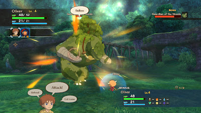
Ni no Kuni: Wrath of the White Witch


Level-5 is one of my favorite game studios in business right now. Their catalog includes brilliant games like the Professor Layton series, Inazuma ElevenDragon Quest VIII and IX, and a whole host of other imaginative, interesting games. Along with Atlus, they’re one of the few companies that still release quality JRPGs, a genre I’ve always been quite fond of.

Ni no Kuni is their latest game. And it is wonderful.

It begins simply. We’re introduced to the main character, a small boy named Oliver, along with his geeky friend and his kindly mother. They live in a tiny town called Motorville. Our friend persuades us to sneak out around midnight, which causes a chain of events that end with Oliver nearly drowning in a river. His mother rescues him at the last minute, but the stress of the event causes her heart to give out, and she passes away in the hospital.

While Oliver is mourning, he accidentally awakens a fairy sealed away in his stuffed animal. The fairy tells him that there’s another, magical world connected to this one, and it needs to be rescued from an evil wizard named Shadar. Oliver initially refuses, but the fairy reveals that his late mother has a counterpart in the other world that is being held prisoner by Shadar. If they rescue her, it might bring his mother back in his world. He agrees to help, and the two travel to the other world to find Shadar and rescue Oliver’s mother.

This is a lovely premise for an RPG. Other JRPGs like Xenosaga or Final Fantasy XIII (or really any Final Fantasy after five) overload the player with jargon and metaphysics, with the hope that he or she will keep playing just to figure out what the hell is going on. That’s not necessarily a bad thing – some games have used such an approach to great success – but Ni no Kuni endears the player to its characters and world right off the bat, with no need for flashbacks or other narrative workarounds. Once the game begins proper, we’ve got a magical world to explore, a wicked sorcerer to stop, and an actual motivation: we might get to see our mom again. Who can’t relate to that?


From there the game progresses as you'd expect. You visit towns, plunder dungeons, and fight bosses. Characters and party members are introduced, make you care about them, and undergo interesting arcs. You fight your way through an evil castle, meet the Queen of the fairies, and save a city from a volcanic eruption. And of course, you collect the three magic rocks to power the ancient weapon of a lost civilization. Obviously it’s not the most original game in the world, but it’s not like there’s an epidemic of classic sword-and-sorcery JRPGs out there. What's the harm in a new iteration of a classic formula every couple of years?

What makes it work is the execution. The main cast and story are well-done, but what truly elevates the game is its genuinely menacing antagonist, Shadar. He's clearly aping Golbez from Final Fantasy IV (the single most imposing villain ever rendered in 16 by 16 pixels), but Golbez didn’t have full voice acting and a fresh, HD look courtesy of Studio Ghibli. He’s not nearly as effective as Golbez at wrecking your party’s shit at every turn, but he still has presence, something sorely lacking among many video game villains.

Most of the best story material is near the end, when the game finally explains Shadar’s motivations and his link to Oliver. The game finally reveals its main theme: it’s a game about love and friendship and coming-of-age-stories and all those other tropes common to the genre, but it's primarily a game about loss. It’s a mature direction to take the story, and it manages to convey itself without conflicting with the rest of the game’s jovial tone. Granted, I'm not a fan of how the game hides Shadar's motivations until an info dump after you've already defeated him, but these are two characters that complement each other and provide different perspectives on a single core theme. That's good storytelling, folks. 

My only real problem with the story is an odd decision involving the ending. Had the game rolled the credits after the fight with Shadar, it would have had a perfectly satisfying conclusion. But it doesn’t; instead it goes on for another four or five hours, with an entirely separate final dungeon, final boss fight, and ending. It’s not a bad five hours – unlike BioShock and it's often-reviled conclusion, Ni no Kuni’s second ending is just as well-done and enthralling as the rest of the game. The White Witch is a good villain, whose motivations again compliment Oliver's and provide another perspective on the core theme. But she just feels redundant. Having two entirely distinct climaxes and endings, competent though they may be, is just inelegant. Apparently the two villains are both fought in succession in the Japan-only DS version (which was developed separately), which seems to me like a much better choice.


Gameplay-wise it's quite solid, at least as far as the combat is concerned. While the AI for the supporting characters is a little wonky, the action-oriented nature of the combat gives it the same pleasing kineticism of Square's early forays with timing-based combat, like Chrono Trigger or Final Fantasy IV. Mashing triangle to have all of your characters attack a boss as hard and fast as they can, only to start mashing Square when he starts charging his ULTIMATE ATTACK and praying that everyone defends in time -- that's a great feeling. It's a little like Final Fantasy XIII's combat engine, which I recall having some fans in spite of the rest of the game's overall lousiness. It would have benefited from being able to directly control your party members, but that wouldn't have worked without completely restructuring the battle system, so I’m fine with how it turned out.

Combat is played out mainly using familiars, like in Shin Megami Tensei or Pokémon. There are more customization options in this game, however. Not only can you teach and equip each of the familiars with different moves, but you can also equip them with different weapons and armor, evolve them into more powerful forms, and feed them different foods to raise their stats. It’s a lot to keep track of, and some of the systems could have withstood a little trimming, but I had a nice time optimizing my party between dungeon crawls. There are hundreds of different familiars to collect if you’re into that sort of thing, but the game is perfectly content to let you collect six or seven monsters and focus all of your energies on them if you’d rather just experience the story.

There’s also a whole quest system lifted straight out of Level-5’s (phenomenal) Dragon Quest games. They’re your typical MMO filler quests -- bounty hunts, finding certain items, bringing someone his lunch, et cetera -- but they’re decently fun and wholly optional. Again, you’ll have a nice time 100%ing everything if that type of gameplay appeals to you, but if you’d rather just play the damn game you won’t suffer any penalties.


My one significant complaint about Ni no Kuni, and a fault that it unfortunately shares with many modern games, is its inane desire to hold your hand the entire game. There’s your usual smorgasbord of patronizing design choices: an absurdly detailed mini-map with a destination marker that trivializes exploration, a text box across the top of the screen at all times that spells out your next objective, text boxes that explain how to talk to people, text boxes that explain how to move, a fairy companion for giving out unneeded hints, et cetera, et cetera. I’ve grown to accept that this kind of thing annoys me a lot more than it does other people (in my opinion it’s singlehandedly ruined modern Zelda, an opinion few others seem to share), so while it is obnoxious I can accept that some people appreciate it. What I cannot accept is that this patronizing design actually makes an entire gameplay mechanic completely pointless.

So. It’s possible to cast magic on the field screen. There’s a whole mess of spells you obtain that are castable outside of battle. That's a clever idea; the problem is that most of these spells are used several times, and then never again. And even then, the game never asks you to use a spell unless it explicitly spells out exactly which spell to use and where.

To whit: there’s one ability called “Bridge” that allows you to cross gaps. If this had functioned like the bridge in the original Legend of Zelda, where you could use it on any one-block wide gaps you came across, it would have presented a neat shortcut to make backtracking a little more interesting. There are several broken bridges in an early dungeon, and being able to cross them instantly on subsequent visits would have been very satisfying.

But instead, you can only use the spell at specific areas. Examine a gap in an obvious dead end, and then your fairy side kick might pop up: “A gap! How do we get across? Don’t you have a spell that can handle stuff like that?” Upon which your spell menu pops up, and you get to select the one spell that seems applicable. The magic system could have been used to fill dungeons with unique, interesting puzzles like in an early Zelda or Lufia game. Instead it’s just another tick mark on the back of the box: “You can use magic outside of battle even if it does absolutely nothing 99% of the time!”  If the game is going to spell out every occasion when you can use magic on the field, then what’s the point?

This is really only a minor criticism -- as a whole the game is a tremendous success. It’s beautiful to look at and listen to, it has a meaningful narrative and excellent characters, the side-stuff is fun without unduly intruding on the main quest, and it has a neat combat engine. It’s a great JRPG, and there’s certainly been a shortage of those lately. It proves that JRPGs don’t need to be pretentious to be interesting, or convoluted to be fun. It doesn’t do anything the genre hasn’t seen before, but that’s not a bad thing because it does it all so well. We’re a third into 2013, so we’ve still got another five or six months before people start talking about their “Game of the Year.” But as far as I’m concerned, out of what has been released so far, this is the game to beat.


Greetings and Salutations


So! I recently finished playing through Ni no Kuni with my girlfriend, and I realized afterward that I wanted to write about it. It used to be that when that happened I'd send it off to SocksMakePeopleSexy, but it's been going through some downtime lately and it's not really accepting fresh contributions. Since I've heard there's a drastic shortage of video game-related blogs out there, I'm going to start hurling my thoughts out into the ether for those that are interested.

Up next: two thousand words on Ni no Kuni. After that? Who knows!

Image ganked from this DeviantArt account I found on Google Image Search. Thanks!